Pages

Tuesday, July 01, 2025

July Reveal for Craftin' Around the World

Welcome to another reveal for the month of July for Craftin' Round the World Blog Challenge. Each month, there are exciting challenges, including a sketch (both for cards and scrapbooking) and every other month you can choose from a Tic-Tac-Toe; where you pick a vertical, horizontal, or diagonal line of use the prompts to inspire your creation or an inspirational Moodboard to inspire you. This month, I’ve tackled both the scrapbooking sketch layout and the Tic-Tac-Toe challenge, but today I’m thrilled to only reveal my creation based on the scrapbooking sketch. You’ll have to stay tuned for my Tic-Tac-Toe layout later in the month. 

Using sketches as a foundation for your projects is incredibly versatile. They can serve as direct inspiration, or you can modify them to suit your style—flipping or rotating them as needed. This flexibility allows for endless creativity and personalisation. Here is this month's sketch; I hope it inspires you to be creative. 

I had a fantastic time with this month’s sketch. The moment I saw the round element, I knew exactly what I wanted to do: I had to include a wagon wheel. As I didn’t have one on hand, I decided to hand-paint one using watercolours and then fussy cut it out. It turned out beautifully and adds the perfect touch to my photos of the girls having fun with a big old Clydesdale horse.

Another element of the sketch that caught my eye were the tags. Lately, I’ve been incorporating tags into just about every layout I create. There’s something about them that gives the perfect finishing touch, whether for journaling or hidden journaling or just as an embellishment—perfection.

Fussy cutting out the florals from some beautiful Cocoa Vanilla patterned paper was such a therapeutic experience for me. There’s something calming about the process, and it allowed me to immerse myself in the intricate details. Once I added those pretty blooms to my layout, they brought a stunning vibrancy that truly elevated the overall design.

I can’t wait to share more of my creations with you and I hope you feel inspired to jump into this month’s challenges. Be sure to check back for my Tic-Tac-Toe reveal later on.


Tuesday, June 17, 2025

Craftin' Round the World June Creative Team Reveal

 Welcome back for my second reveal for June for Craftin' Round the World Facebook Challenge Group. Just a friendly reminder: we have two challenges each month—one sketch and either a colour moodboard or Tic-Tac-Toe challenge. Join us in sharing your creativity, we would really love to see how you use these challenges:

For my second creative team reveal this month, I took on the sketch challenge and created a layout from Adrian and my recent outing to the Red Hot Summer Concert. It was a fantastic day spent enjoying live music under the sun, just Adrian and me, while the girls had their own adventures.

I stayed quite true to the original sketch, making a slight adjustment by sliding the paper strip lower on the page to preserve the record image on the backing paper. I’m really pleased with how it turned out. I love how scrapbooking allows us to capture and celebrate precious moments like these. I can’t wait to see your takes on the challenges this month.

Happy scrapping


Monday, June 02, 2025

June A Cut Above Creative Team Reveal

 This month for A Cut Above, I have created a layout that is bright, bold, and bursting with fun—perfectly capturing the spirit of my two daughters when they were younger. They were the cheekiest of partners in crime, filling our days with what I like to call Wonderful Chaos.

To bring this lively energy to the page, I reached for a collection of flower metal dies and cut a range of blooms in every colour of the rainbow. I wanted to create a cascade of flowers down the left-hand side of the layout, a playful tumble of colour that would balance against the structure of the folded rainbow fans on the right.

The folded fans are a little nod to my own childhood. I can still remember making them during primary school art classes—folding paper back and forth to create simple, joyful decorations. I thought they would be the perfect addition to this page, adding not only a pop of colour but also a lovely sense of nostalgia.

The juxtaposition between the flowing cascade of flowers and the crisp, structured fans brings a dynamic feel to the layout, mirroring the mix of energy and sweetness that defined those younger days. Whether it’s the rainbow palette, the playful shapes, or the memory of folding fans as a child, I hope this page brings a smile and maybe even a few happy memories for you too.

Thanks for stopping by, and I look forward to sharing more creative adventures with you next month.


June Creative Team reveal for Craftin' Round the World

Popping in to share my first creation for the June challenges at Craftin' Around the World Facebook Challenge roup. Just a quick reminder: each month features two unique challenges: a sketch and either a colour moodboard or a Tic-Tac-Toe challenge. We love seeing how each of you brings your own flair to the challenges so please, if you get some time, pop in and give them a go. The link is on my sidebar on the right to this post. Here are this month's challenges:

For my first creation for June, I opted for the colour moodboard, and it was the perfect opportunity to showcase Bronte’s birthday celebration. The moodboard featured an exciting array of colours, including two shades of green, purple, pink, and a bright blue, all of which reflected the vibrant atmosphere of the day.

The photos I used are of Bronte and her friends enjoying a buffet dinner—what a treat for them to sit at a table just for the "kids". To enhance the festive vibe, I included pink glitter paper, hand-drawn borders, mists, and splats, along with some funky buttons and tassels. In an attempt to give my button collection a fresh twist, I adhered them down and wrapped interconnecting strings between them, resulting in a fun, dynamic element.

Can’t wait to see how you all interpret this month’s challenges.


Monday, May 26, 2025

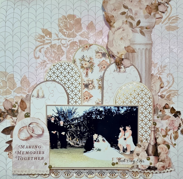
Guest Designer for Paper Rose Studio – A Wedding Joy

I was asked to be a Guest Designer for Paper Rose Studio, an I was so excited to take up this opportunity.  Getting the chance to play with gorgeous products and share a bit of what I love—it’s always a treat. The collection I was assigned? Wedding Joy. And what a joy it truly was.

This collection is just divine. It’s the perfect pick for documenting all things wedding, from the big day itself to those quieter, candid moments that mean just as much. The papers feature subtle hues and gentle tones that bring an understated elegance, with accents of roses that are just perfect for fussy cutting. You know when something just works together effortlessly? That’s this range.

To add a bit of sparkle, the die cuts and metallic foil paper in the collection bring in that shimmer and shine without going over the top. It adds versatility too—you can go minimal or really lean into the glamour, depending on your style.

For my layout, I created Making Memories Together, featuring a photo from my brother’s wedding. The collection felt like it was made for these moments. One of the things I really appreciated was how well the soft colours and beautiful designs elevated the photos, even this slightly imperfect one. We’ve all got those, right? The kind that capture the feeling but might not be picture-perfect. This collection helps bring out the best in them.

A special mention has to go to the Wedding Joy Basics C paper. The roses on this sheet are ideal for fussy cutting, and paired with the foil touches, they add lovely texture and sophistication to a page. 

Whether you’re layering elements or highlighting a special photo, it all comes together beautifully.

Thanks again to Paper Rose Studio for having me—it’s been an absolute pleasure.

Tuesday, May 20, 2025

Crafting Around the World Creative Team May Reveal

Today I am excited to share my second Craftin' Round the World Creative Team reveal with you. Just a reminder: each month we have two challenges—one sketch and one colour moodboard or Tic-Tac-Toe challenge, where you are free to interpret them in your own creative way. Here are May's challenges:

Using the Tic-Tac-Toe inspiration, I went for a diagonal line from bottom left to top right: paper tearing, my favourite colour (which I optimistically interpreted as "rainbow"), and florals. I absolutely love using paper tearing to add texture to my layouts—it creates such an organic feel. Choosing my favourite colour was a delightful challenge, but I decided to embrace the whole rainbow spectrum; after all, who doesn’t love all the colours?

I chose a vibrant photo of Paige enjoying her favourite drink—Dragonfruit Mango Lemonade—while we were in Hawaii. It captures her sheer joy and is the perfect focal point for a cheerful layout. As always, I incorporated florals, which naturally fit into my style.

Looking forward to seeing your interpretations of the challenges!


Monday, May 05, 2025

May A Cut Above Creative Team Reveal

Hello, friends. I am so excited to share my Creative Team Reveal layout for May at the A Cut Above Challenge Blog. If you haven't checked out the blog yet, head over here for all the crafty inspiration. The theme for the monthly challenge is always Anything Goes, but the twist is that at least one die-cut needs to be included in your project. So, whether you’re a seasoned scrapbooker or just starting out, this is the perfect opportunity to explore the wonderful world of die cutting.

For this challenge, I wanted to create something truly special to showcase two of the most important people in my life—my daughters. The photos I chose were taken when they were just a few days old, and when I looked at them side-by-side, I couldn’t help but notice how similar they looked at that age. It was such a sweet and precious moment, and I knew I wanted to capture it in a meaningful way with a scrapbook layout.

The first thing I decided on was the theme and colour palette for the layout. Since this page was going to feature my two little ones, I wanted to keep the colors soft and gentle—think light pink, peach, and a soft minty green. These colours evoke the softness of newborns and add the perfect balance of calmness to the page. However, I didn’t want it to feel too plain, so I decided to incorporate a pop of darker purple / blue for some contrast and visual interest.

I wanted to draw the eye to the photos of my daughters while also creating something visually captivating. My solution? A lovely, eye-catching floral arrangement that would lead the viewer’s eye down the page and direct their attention toward the precious photos at the center bottom of the page.

Here’s where die cutting came in! For me, die cuts are the magic behind transforming a layout from “okay” to “wow!” With just a few simple steps, you can create beautiful embellishments that add sophistication and dimension to your work. The best part? You don’t need to be an expert to get stunning results!

For my layout, I used die-cut flowers, but I wanted to make sure they didn’t just look flat or boring. To add dimension and make them truly pop, I made the flowers 3D. I die-cut multiple shapes of flowers and leaves and then assembled them by layering them on top of each other. But, instead of leaving them all flat, I used a few fun techniques to add shape and life to the flowers.

If you’re new to die-cutting or want to improve the dimension of your embellishments, here are a few tips that I swear by:

* Layer Your Die-Cuts: Start by cutting multiple layers of the same flower shape. Layering the pieces will give your flower height and fullness.

* Curl the Petals: Before assembling, curl the edges of each petal using a pencil, paintbrush, or bone folder. This gives the petals a natural, lifelike curve that makes them stand out.

* Add Water for Extra Curl: For an even more dramatic curl, lightly mist the cardstock with water before shaping the petals. The water helps the paper hold its shape, and it adds a beautiful texture to your flowers.

* Mix and Match Colours: Don’t be afraid to use different shades of cardstock. By layering petals in varying shades, you create depth and dimension, making your flowers look more realistic.

* Assemble and Attach: Once you’ve curled your petals and layered them together, attach the layers using foam adhesive or pop dots to create the illusion of a 3D flower.


For my layout this month I used the simple curl method for the large flowers, where after I cut them out of the cardstock I wrapped the petals around the wooden handle of a paintbrush so that they curled up and around. These simple steps transformed my flat die-cut flowers into vibrant, dimensional elements that draw attention to the photos and bring life to the layout. The flowers not only add interest but also help tie the whole page together beautifully.

If you're a beginner scrapbooker and haven't yet explored die cutting, let me tell you—it’s a game-changer. Die cuts can take your layouts from flat and plain to dynamic and eye-catching without needing too many extra supplies or tools. All you need is a die-cutting machine, dies, some cardstock, and a bit of creativity, and you’re on your way to creating incredible pages.

Once you get the hang of it, you can start experimenting with different dies, colors, and textures to create endless embellishments for your layouts. Whether you’re adding flowers, shapes, or even intricate backgrounds, die cutting is an essential technique that opens up a world of possibilities for scrapbookers at any skill level.

I hope my layout has inspired you to try your hand at creating beautiful die-cut embellishments for your own pages or cards. Don’t forget, you can join in on the A Cut Above Challenge this month; it’s a fantastic opportunity to showcase your creativity.

Thanks for stopping by, and until next time, happy scrapping.

Friday, May 02, 2025

Craftin' Round the World May Creative Team Reveal

Hello I have my first May Creative Team reveal for you that I am excited to share. Each month, there are two fun challenges at Craftin' Around the World Facebook Group: one is a sketch for either a card or a scrapbook page, and the other is either a colour moodboard or a Tic-Tac-Toe multiple-choice challenge. For May, the choice is these two fabulous challenges: 

For my first layout this month, I decided to celebrate the delightful differences between my daughters, Paige and Bronte, and I used the scrapbooking sketch as inspiration. During our recent breakfast at the Singapore Zoo, we had the chance to meet some amazing exotic animals, including a fascinating iguana. This photo perfectly captures Paige's adventurous spirit as she eagerly reached out to touch the creature, while Bronte observed from a safe distance, declaring it "too ugly" for her liking!

I flipped the original sketch on its side to accommodate my portrait photo, which allowed me to highlight the stunning colours of the iguana. I chose natural browns, greens, and oranges for my layout to harmonise with the scene and keep it earthy and inviting.

Stay tuned for my second May reveal for Craftin' Around the World later in the month, and don’t forget to join in on the fun.

Thursday, May 01, 2025

Scrapping 4 Fun Announcement


I am so excited to announce I have been selected for the Scrapping4funChallenges Facebook Group Design Team

S4F is lovely friendly Facebook group where monthly challenges are posted. The Msy theme is "Anything Goes" so I decided to reminisce about a hot sunny unfilled day at our first Hall Markets where the girls literally ran and tumbled on water... granted they were in huge air-filled balls. 


Given that it was such a sunny day had me thinking of sunburst so I had to include them on my creation with the paper pieces sunburst and the colourful stencilling I did.


Monday, April 21, 2025

Wrapping up the Scrapping Clearly Easter Crop

 Well, I’ve officially finished all six challenges from the Scrapping Clearly Easter inspired cyber crop over the weekend, and I’m popping back in to share the last two layouts – challenges 4 and 5.

Challenge 4: Chocolate & Pastel Creams

This one was such a treat to put together. I used a sweet photo of my youngest daughter Paige – normally she’s all about the “tomboyish” face paint, but this time she surprised me with a colourful bunny face. It was pastel-perfect and would go with the chocolate criteria too. I went for lots of torn paper layers to add some texture, then tried something a bit different by rolling the paper back to reveal some embossed butterfly cardstock underneath, which I inked with brown and pink. I also added a brown dyed embroidered doily for extra texture, flicked on a bit of gold glimmer spray, and used glittery gold stickers for the title to bring it all together.

Challenge 5: Easter Memory Lane

This one stumped me at first – we’re not big on Easter traditions – but it got me thinking. One little tradition we do have is getting new pyjamas on Easter Eve and Christmas Eve. So I went with that. I included some hidden journalling tucked behind the photo and used a few fun SnapChat pics of the girls and me. We’d been playing around with vintage-style filters, which ended up being just right for this theme. Not your typical Easter pics, but they tell our story.

It’s been such a lovely Easter – loads of family time, far too much chocolate, and lots of creative time for me… what more could I ask for?

Sunday, April 20, 2025

Scrapping Clearly Easter Crop Fun


This weekend I’ve been joining in on the Easter-inspired Cybercrop over at the Scrapping Clearly Facebook group and it's been such a lovely creative time. The whole weekend has been packed with inspiring challenges, a real treat for the crafty soul, and I’ve managed to complete four out of the six so far. I’m planning to finish the last two today, so there might be a follow-up post soon with more scrappy goodness.
As soon as I saw the challenge list, I knew I finally had the perfect excuse to scrap some very sweet photos from fifteen years ago — the first Easter that Bronte and Paige had together as sisters. Back then it was so much easier to convince them to sit together and let me play photographer for our little Easter photo shoots.

Scrapping Clearly really did a great job putting six Easter-inspired challenges together. Here is a quick summary of them:
1. Vintage Easter Elegance
2. Egg-strvagant Layers
3. Bunnies, Baskets & Blooms
4. Chocolate & Pastel Creams
5. Easter Memory Lane
6. Mixed Media Easter Tag Trio
If you want to know more, you are just going to have to join in with the crop on their Facebook group.  Just like I did, read on to see how I completed four of the challenges so far. 

1. Vintage Easter Elegance

Now, vintage really isn’t my usual style, and I don’t have many vintage photos lying around, but I gave it a red hot go. I started with a photo of the girls and applied a vintage filter to give it that soft yellowed tint. I paired it with manilla and beige tones, added some pastel shades, then inked and distressed the edges to give it that worn-in feel.
As a bit of a two-for-one, I also did challenge six here and created some Easter-themed tags to include. I finished the layout with a handwritten title and a scattering of vintage Easter cut-outs that look like they came straight from Grandma’s chocolate box.
It’s probably the most vintage I’ve ever gone and I actually think it turned out quite sweet.

2. Egg-stravagant Layers

For this one, I hand-cut a giant Easter egg from white cardstock and backed it with gold foil paper covered in little bows. I faux stitched around the edge of the egg for a bit of texture and then went wild with bright pastel florals. I fussy cut and layered them over the background for a bit of whimsy, added a handmade silk bow, some velvet scalloped trim, a little strip of plastic fringe with gold accents, and a shiny title.
Of course, no egg-stravagant layout would be complete without at least one more egg, so I added another fussy-cut egg with two adorable chicks. This layout is definitely a bit of a chick magnet — it has fluff, sparkle, and a whole lot of personality.

3. Bunnies, Baskets & Blooms

This one had me thinking, especially since I didn’t have any basket embellishments in my stash. So, I grabbed the watercolours and painted my own basket. Somehow it actually turned out just like I imagined, which doesn’t always happen.

One of the challenge criteria was to include an interactive element like a pocket or flip card. I decided to turn my painted basket into a pocket and tucked the photo inside it, along with some fussy-cut flowers and hidden journalling behind the photo (see the photo below for a sneak peak - sorry it doesn't really show it well) it’s a sweet little surprise tucked into the layout.

The flowers are from a 12x12 transparency sheet — they originally came in a wreath shape, but I fussy cut them and arranged them around the basket and photo instead. They add such a soft, delicate touch. I also printed and cut out a bunny to add a bit of Easter magic, and finished it off with a hand-drawn, ribbon-inspired border and a handmade bow.

6. Mixed Media Easter Tag Trio

As I mentioned earlier, I actually combined this one with the Vintage Easter Elegance layout, but I did go a little rogue and made four tags instead of three. They’ve got all the mixed media goodness — inking, stamping, lace, and some soft silk ribbons. They’re very much in line with my attempt at vintage, and I think they complement the main layout beautifully.

It’s been such a great weekend of creative play, and the Scrapping Clearly community has been wonderfully inspiring. I’m hoping to finish off Challenge 4 – Chocolate & Pastel Creams and Challenge 5 – Easter Memory Lane today, so I might pop back in later to share those once they’re done.

Happy scrapping — talk soon.

Wednesday, April 16, 2025

Craftin' Around the World - April Colour Inspiration

For my second Design Team Reveal for Craftin'g Around the World for April I just had to do the colour challenge — and oh boy, what a gorgeous (and slightly unexpected) combo we've got to play with. The inspiration comes from a stunning photo of a sunset over a wooden dock, featuring rich purples, a deep brown, bright yellow, and salmon pink. Not your everyday palette, but trust me, these colours are magic together.

I’ll be honest — I didn’t have a paper range in my stash that matched anything remotely close to this combo. But hey, that’s half the fun of a challenge, right? So I dove into my paper stash like a treasure hunter on a mission, rifling through piles of papers until I found a few pieces that felt like they could work together. Warm browns, a few different purples, a splash of yellow, and a hint of coral — not a perfect match to the photo, but close enough to give it a whirl.

And wow — what a pleasant surprise! Sometimes colour combinations that seem a bit "iffy" at first end up blending beautifully in the end. The way those warm tones played off the cooler purples created this gorgeous balance, and the contrast made everything pop.

The real magic moment, though? Adding a photo of Bronte in her brown knit top with her face painted in stunning purple butterflies — it was like the missing puzzle piece that tied everything together perfectly. Her photo brought warmth and vibrancy to the layout, pulling those colours into harmony. Proof that sometimes, taking a chance on an unexpected colour combo can lead to delightful results!

So if you're feeling a bit unsure about trying bold or unusual colour mixes — just go for it. You might just be surprised at how well they complement each other in the end.


Monday, April 07, 2025

Fluttering into April with A Cut Above Challenge Blog Design Team Reveal


 For those not yet in the know, A Cut Above Challenge Blog is all about celebrating the magic of die cuts in our crafting adventures and I am so excited to share my Design Team creation with you. Each month, the Design Team puts together inspiration projects that showcase clever ways to use metal dies — from intricate accents to bold focal points. The goal? Inspire you to cut, create, and conquer. So, grab those trusty die cutters and let the creativity flow.


This month, I felt inspired to create something delicate and feminine — a layout that captured one of those rare, golden moments when my daughters were getting along beautifully (yes, those moments exist). I knew that butterflies would be the perfect accent to reflect the sweetness of that photo.

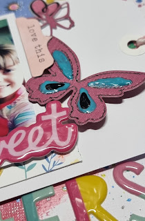
To start, I picked a complementary cardstock colour that blended beautifully with my layout’s palette. I then grabbed not one, but TWO butterfly metal die cuts — because why settle for one when you can double the flutter factor? After cutting out my butterflies, I realised my larger one needed a little extra pizazz. Enter: my trusty black pen. I traced over the stitched detailing on the die cut to match the black outlines in the floral designs on my layout. This subtle touch helped the butterfly feel cohesive with the overall design.

Still feeling like my fluttering friends needed a bit more colour, I reached for my Nuvo Crystal Drops. I carefully added black and aqua drops into the teardrop shapes on the butterfly’s wings, adding just the right amount of shimmer and pop.

For placement, I arranged my butterflies diagonally across the page, creating a visual trail that feels like they’re soaring skyward. It’s such a simple technique, but it really draws the eye across the page and brings everything together beautifully.

So, if you’re feeling inspired to spread your creative wings this month, be sure to join us over at A Cut Above Challenge Blog. Let’s see those metal die cuts in action — I can’t wait to see what you create.

Happy scrapping and may your butterflies always fly in perfect formation (unlike my daughters most days)  :)